MEUBLL, our first Custom Theme for e-commerce – Part 1
Develop an idea, create value, stay inspired
The main goal behind our custom themes for e-commerce is simple: show that Front-Commerce can do everything proposed by an actual ecommerce platform, but better, faster and more easily; combining a smooth user experience with an attractive design. A hard task in perspective!
In order to be more relevant, faster and able to deal with several topics in a short time, we’ve chosen to work as follows: each theme will highlight one precise and relevant feature, and only one. Working like that allows us to propose more themes and more features while significantly reducing the development time (few pages to design, only the useful ones for the related feature).
First theme, first feature
The first track we’ve chosen to explore is the possibility to buy grouped products.
If you want to buy one and only one product, you just have to visit the related page and then add the product to your cart. Nothing too complicated. However, if you’re interested in several products (you think they combine well and want to buy them at the same time), the process suddenly gets harder and repetitive. You need to individually go on each product page, add them to your cart while remembering which one you’ve already added or not. Not really practical, isn’t it?
Starting with this statement, we decided to iterate on the subject, trying to answer the following question: how can we make purchasing grouped products easier whilst ensuring a smooth and intuitive process?
After benchmarking the market competition, searching for good practices and ideas to inspire us, we started to work on the following feature: product collections.
In order to customize this feature with relevant content, we chose to work with home decor products. Who among us doesn’t want to easily create the perfect room in one single purchase? 🙂
Next step: define how the feature will work.
Here are some ideas proposed by our team. We developed them one by one, then tested them with real users in order to validate them or not.
A – Create an alternative navigation
When you talk about “product collections”, you need a custom navigation process in place. A “classic” navigation won’t allow users to access grouped products, or a specific occasion (lookbook for example).
Moreover, surfing from one product to another, then remembering which one you’ve already seen, can quickly become a puzzle for the user. You need to avoid that.
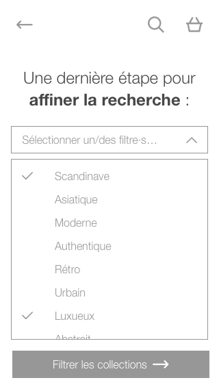
We’ve decided to create a “by collection” navigation. Users will access this secondary navigation, with which he will be able to select a room and the furniture styles he or she likes. After that, a filtered list of collections will be proposed based on his previous choices. Each collection will be composed of products identified with a tag.
B – An interactive image to project the user’s mind
Second idea, and logical following of the first one: implement an interactive picture to stimulate the user’s imagination. After having selected a collection in the list, the user is taken to a related presentation page.
An interactive image will be displayed at the top of the page, with all products available in the collection. The image will highlight how products combine together, in context. It allows users to have a quick overview of the collection. It helps him or her either make a choice or else be directed to another collection.
Below the image, the user will find the current collection’s description, all the available products and a link to the next collection.
Why do we think it’s cool?
Creating an alternative navigation can be complex and time-consuming when using a classic CMS’s native templates. Front-Commerce allows you to forget these limits. Setting it up becomes very quick and allows you to propose original, adapted & user-friendly design.
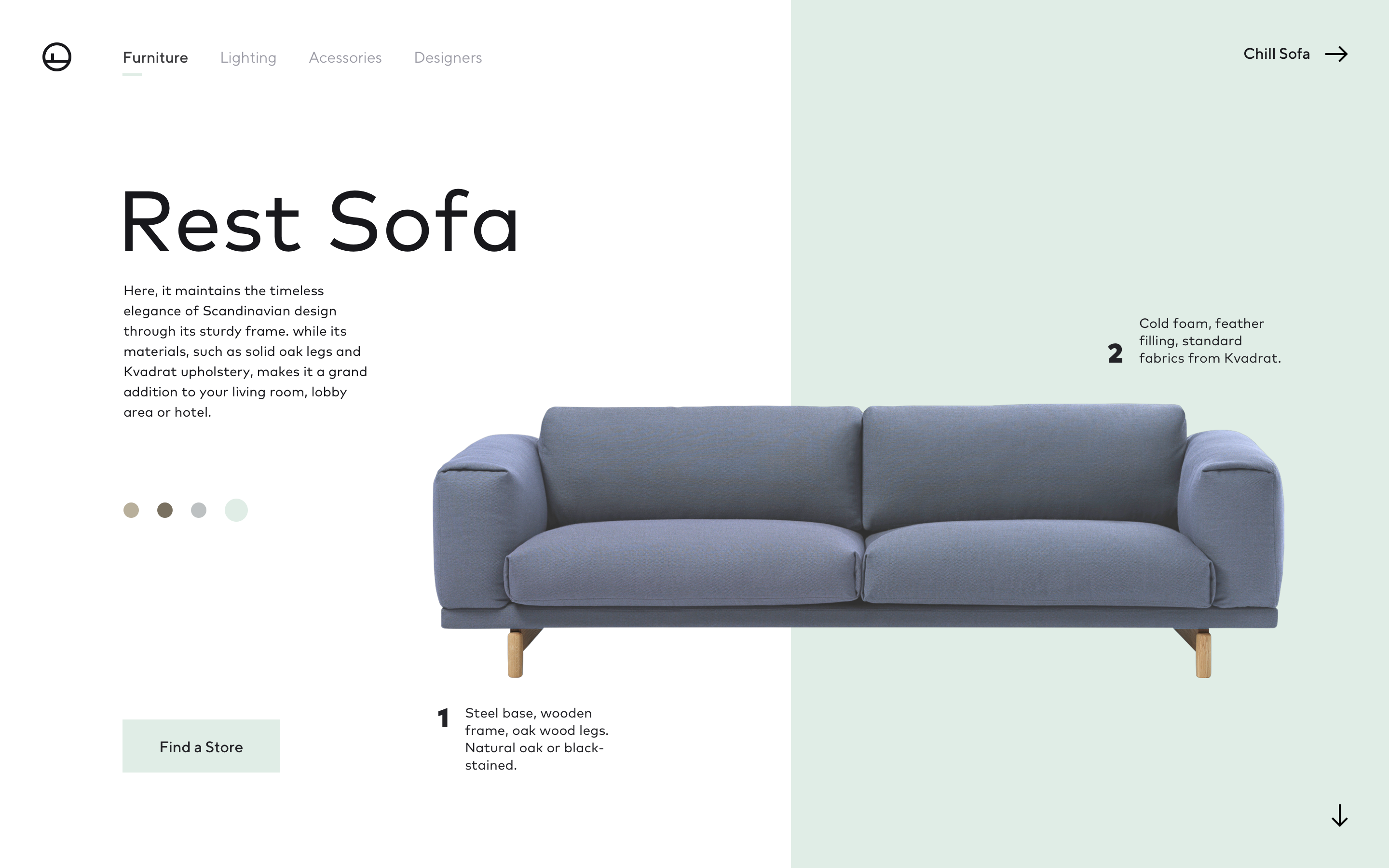
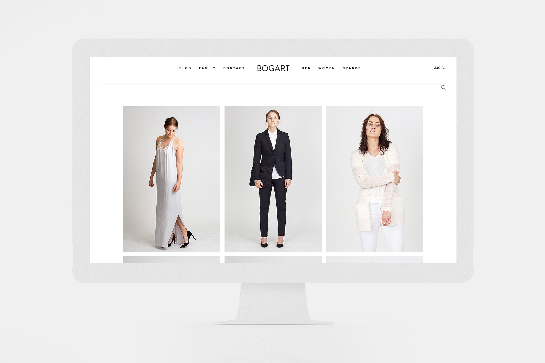
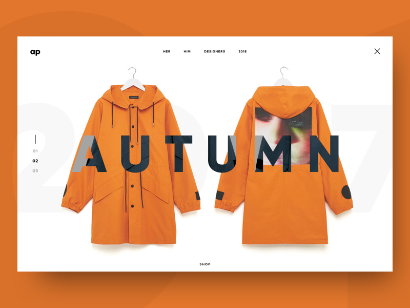
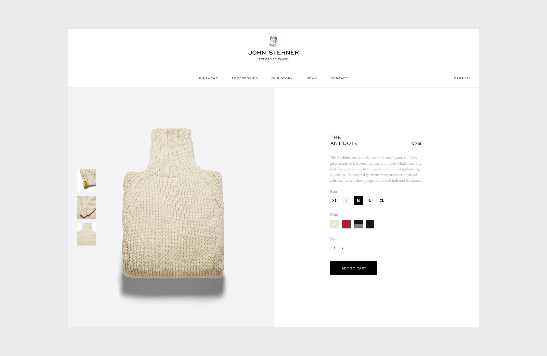
We then started to think about what the interface could look like. We all agreed that visuals would play a central role to help users to immerse and see themselves in the room.
Here is some of our inspiration:
And some of the first wireframes we created, for mobile devices. Yup, it’s in French. Oopsy!
Involve your users
Before going further in the process, gathering user feedback is really important. Do they like the feature? Do they find it useful? What do they think of the wireframes? Are there critical points missing?… So many questions to answer, so many things to test..
We’ve decided to test our wireframes, and so we’ve recruited testers, proposing a short test session in our office.
Hear more about this in part 2! 🙂
It’s a 4 part series!
Part 1: Develop an idea, create value, stay inspired You’re here!
