A frontend is an e-commerce website’s storefront. This makes it the most important element of your entire e-commerce system. We’ve had a look at some of the best e-commerce frontends of 2022 and made a little selection for you. These frontends are not only aesthetically pleasing but also high-performing and, in most cases, headless.
But before we take a look at the best e-commerce frontends of 2022, let’s take a look at the top 10 elements or features that the best e-commerce front-ends typically share!

Not sure what Headless commerce is?
Top features of a high-performance e-commerce frontend
- A clean and intuitive user interface (UI) that is easy to navigate and use.
- High-quality product images and descriptions that help customers make informed purchasing decisions.
- A search bar or filter system that allows customers to easily find the products they are looking for.
- A secure and reliable payment processing system that protects customers’ financial information and ensures smooth transactions.
- A responsive design that ensures the website looks and functions properly on a variety of devices, including smartphones and tablets.
- A well-designed checkout process that is easy to follow and minimizes the risk of abandoned carts.
- A customer support system, such as a live chat or email support, that allows customers to quickly get answers to their questions.
- A personalized experience that tailors product recommendations and other content to individual customers based on their preferences and browsing history.
- Integration with social media platforms and other marketing channels to help drive traffic to the website and increase sales.
- Regular updates and maintenance to ensure the website remains secure, user-friendly, and up-to-date with the latest ecommerce trends.

How to migrate from a monolith to headless commerce
Top Headless Ecommerce Frontends of 2022
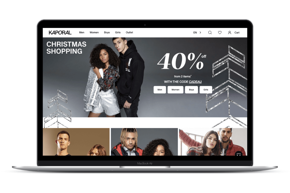
Kaporal
The iconic french clothing brand Kaporal was looking to it to make its e-commerce site evolve as efficiently as possible while preparing for the future. It was confident that migrating to a microservices architecture was the way to go to boost performance. A headless architecture combined with a PWA was chosen to skyrocket web performance and business efficiency. As a result, they had a 60% drop in the bounce rate on all devices, linked to the positive impact on the site’s display performance and speed. Their conversion rates also increased by 15% on desktop and 8% on mobile.
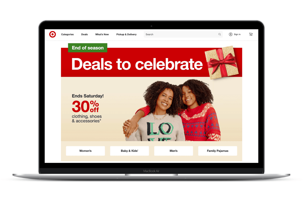
Target
Despite its popularity, Target faces stiff competition from Amazon and Walmart, whose customers are just as willing to move from one brand to the other. The company discovered through data analysis that the vast majority of their clients (80%) begin their purchasing journey on one device and are likely to finish on another. Seeing the device gap as a potential for growth, the brand looked for solutions that could best solve the issue, and naturally, a Headless Commerce strategy to harmonizing the customer experience across different platforms was the answer.
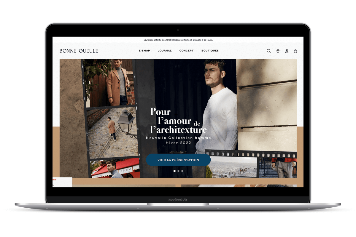
Bonne Gueule
Bonne Gueule has expertly managed the fusion of their media platform and their e-commerce ecosystem. This entailed a full redesign of their frontend and the implementation of a headless PWA. The result is an exceptional customer experience, that is as qualitative as the products they offer.
Nomad
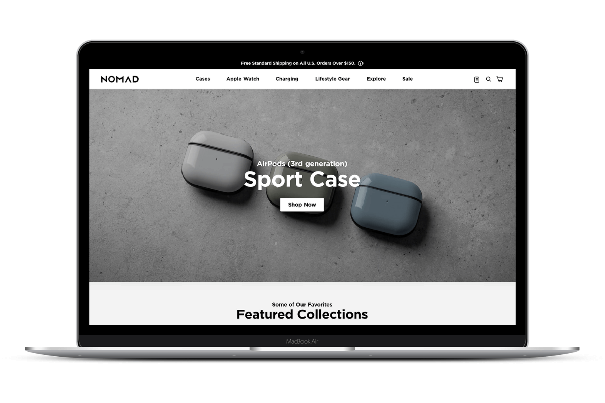
Site speed was a big concern for Nomad, as it was for many other ecommerce companies. Nomad investigated many solutions for improving site efficiency and performance and opted for a progressive web application (PWA) and headless commerce approach. These technologies improved the store performance and helped create a better consumer experience by increasing page speed and load times.
Jérôme Dreyfuss
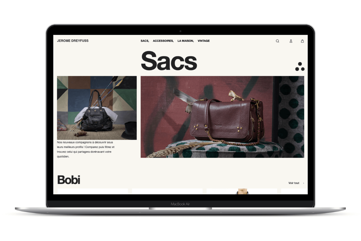
Jerome Dreyfuss wanted to find a solution to separate the different rhythms and limits of a rigid e-commerce platform as part of a total overhaul of their e-commerce ecosystem. To match their customers’ expectations in terms of customer experience, they needed leeway for creativity and flexibility. To solve these issues, they opted for a headless commerce architecture.
Under Armour
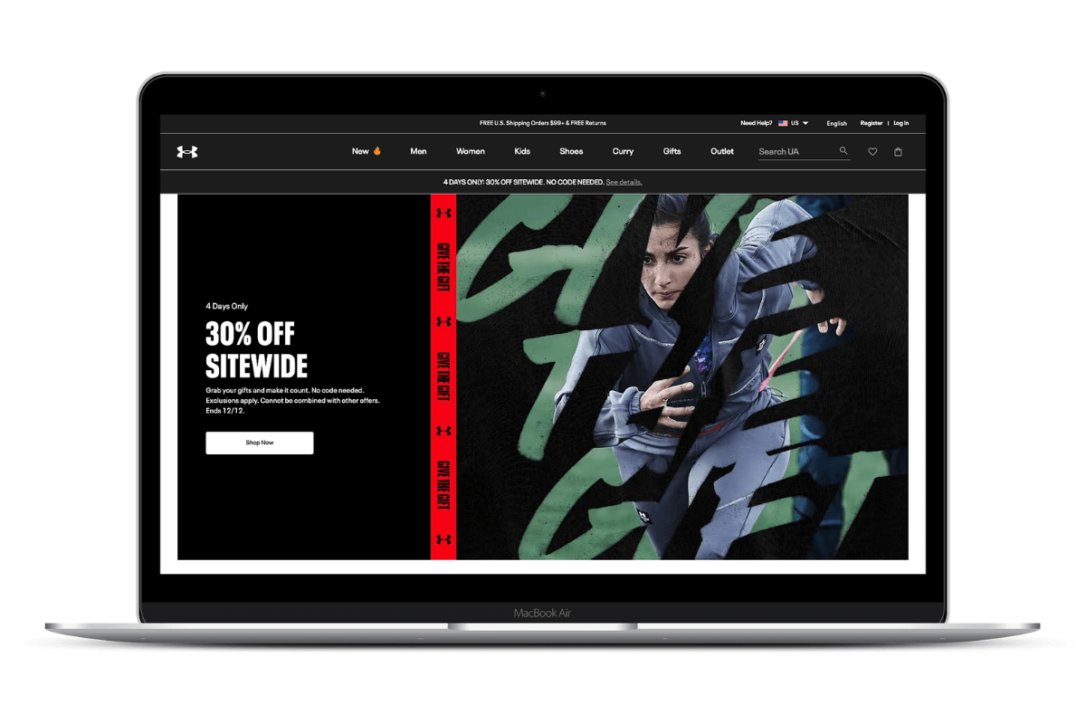
Under Armour was one of the first businesses to have a progressive web app, so they had a broad sense of what their goal was, but little to go on because the Headless approach, specifically the Progressive Web App approach to Headless Commerce, was relatively new at the time. However, with effort and a dynamic mentality, they progressively turned their site into a functional, successful, and high-performing example of a major sportswear store from the United Kingdom.
Devialet
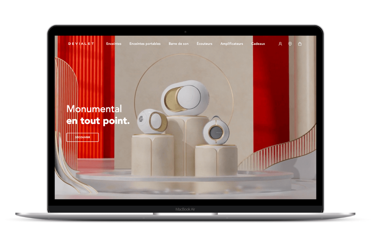
Devialet launched their e-commerce platform redesign with the aim of improving the customer experience and improving their competitiveness in terms of SEO. The specific KPIs that Devialet wished to target were a reduction in bounce rate, an increase in conversion rate and a faster page loading time. The result: a 100% lift in conversion rate, a 25% decrease in bounce rate.
Zadig & Voltaire
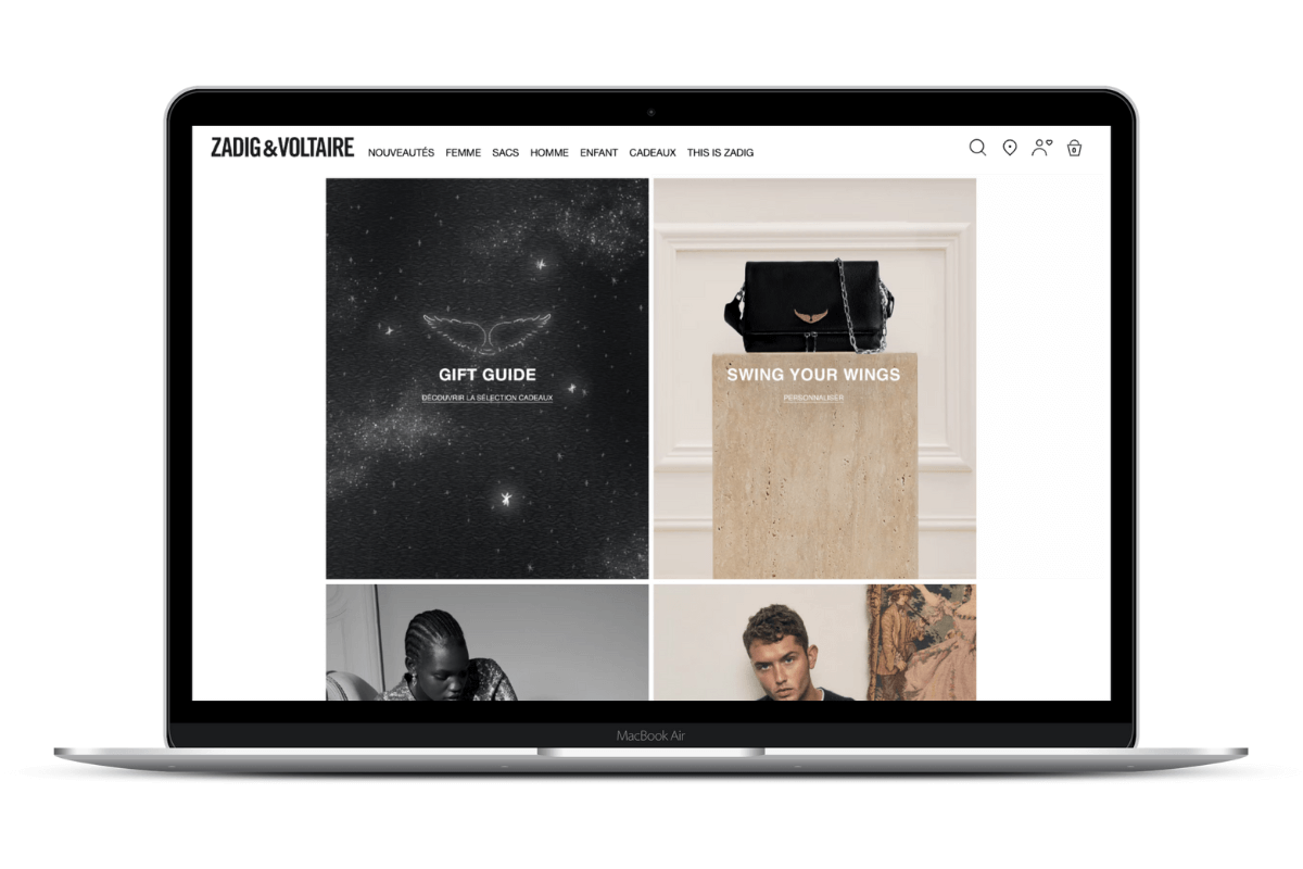
When redesigning their site, Zadig & Voltaire expressed the need to optimise the customer experience through the development of a high-performance, multi-device responsive platform, including the integration of a PWA (Progressive Web App) solution. The result is a pleasant website that offers high-speed performance.
Lancôme
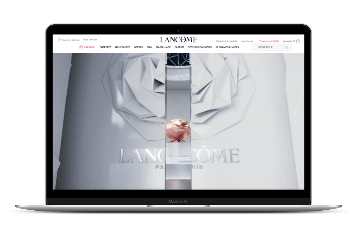
Lancôme, the French luxury perfumes and cosmetics company, recognized the potential in Headless Commerce and joined other big brands in improving user experience through Progressive Web Applications. Lancôme saw a 17% gain in conversion after implementing the Headless approach as well as a 51% increase in mobile sessions.
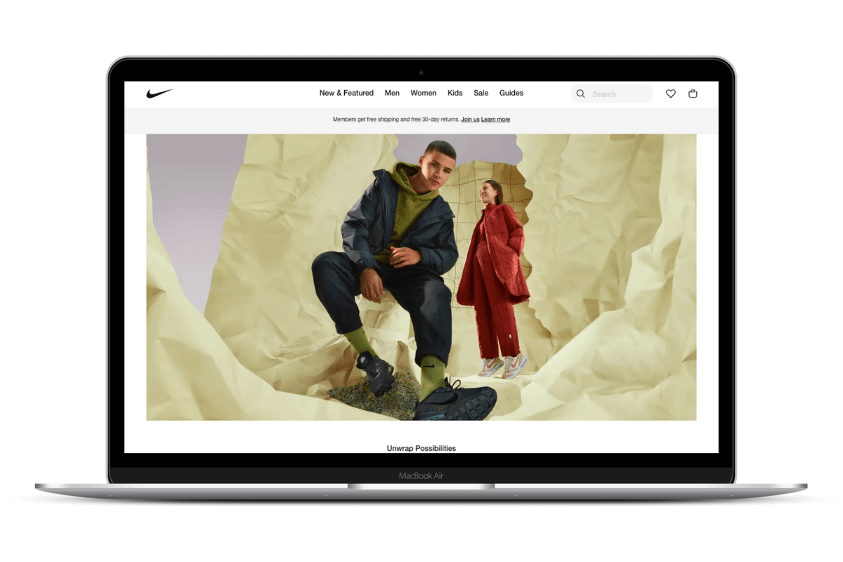
Nike
Nike, like many others, has gone headless. The sportswear company wanted to implement a mobile-first strategy that would best align with their broader plan of increasing sales from mobile clients. React SPA, in conjunction with Node.js backend for frontend (BFF), was chosen and did not disappoint. Nike gradually gained market shares, making the Headless campaign a bigger success than initially anticipated.
